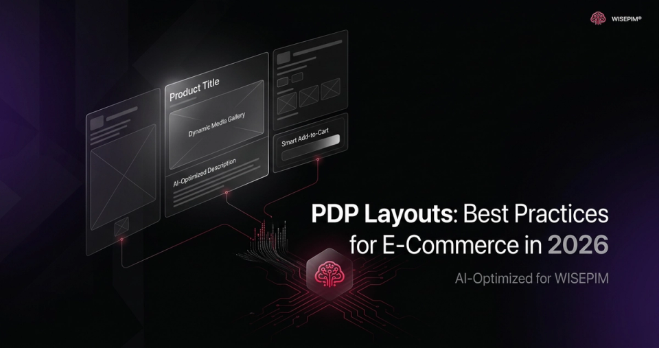
Your product page is prime real estate. But are you using the best layout to convert visitors into buyers? In 2026, understanding product page layout best practices is crucial for e-commerce success.
The overall product page layout provides the structure, the sequence, and a large part of the aesthetics for the product page content. There are four types of layouts that dominate the e-commerce landscape: “Horizontal Tabs,” “Vertically Collapsed Sections,” “One Long Page,” and “One Long Page with a Sticky TOC (Table of Contents).” Let's dive into each one, highlighting their strengths and weaknesses.
Horizontal Tabs: A Hidden Information Graveyard
The “Horizontal Tabs” layout, once a popular choice, is increasingly falling out of favor. The core problem? Discoverability. When key product information is hidden behind tabs, a significant portion of users simply miss it. This is especially true on desktop, where users often scan rather than deeply read. This can lead to frustration, confusion, and ultimately, lost sales.
- Problem: Hidden content leads to missed information.
- Impact: Lower conversion rates, increased customer support inquiries.
- Recommendation: Avoid using horizontal tabs for essential product details.
Vertically Collapsed Sections: Mobile Mayhem
The “Vertically Collapsed Sections” layout presents its own set of challenges, particularly on mobile devices. While the intention is often to create a cleaner, more streamlined experience, the limited viewport of mobile product pages exacerbates the issue of discoverability. Users struggle to get an overview of the product and may miss crucial details hidden within collapsed sections. This can lead to misunderstandings about the product's features, specifications, or even its intended use. The user experience suffers, and so do your sales.
- Problem: Difficult to get an overview of product information, especially on mobile.
- Impact: Misunderstandings, frustration, abandoned carts.
- Recommendation: Reconsider this layout for mobile; prioritize clear, visible information.
Desktop Drawbacks
Even on desktop, long, uncollapsed sections can be problematic. They make it difficult for users to quickly scan and find the information they need. Each section pushes the next one out of view, creating a disjointed and overwhelming experience. Think of it like trying to find a specific line in a never-ending document – it's tedious and inefficient.
One Long Page: Visual Products Get a Pass
The “One Long Page” layout, where all product information is displayed in a continuous flow, can work well for certain types of products. Specifically, if you're selling visually driven items like clothing, art, or home decor, and the amount of textual information is limited, this layout can provide a seamless and engaging experience. The key is to ensure high-quality images and concise descriptions that capture the essence of the product.
- Benefit: Can be effective for visual products with limited text.
- Caveat: Requires high-quality visuals and concise descriptions.
- Warning: Avoid for complex products with extensive specifications.
In-Page Navigation Caveats
However, even with visual products, avoid making in-page navigation needlessly complex. If there's very little content beyond images and reviews, adding a complicated navigation system is overkill. Keep it simple and intuitive for the best user experience.
One Long Page with a Sticky TOC: The Gold Standard
In 2026, the “One Long Page” layout, enhanced with a “Sticky TOC,” is emerging as the preferred choice for many e-commerce businesses. This approach combines the benefits of a comprehensive information display with the ease of navigation. The Sticky TOC, which remains visible as the user scrolls, allows them to quickly jump to specific sections of the page, such as features, specifications, reviews, or FAQs. This is particularly useful for products with a lot of information, as it prevents users from getting lost or overwhelmed.
- Benefit: Easy navigation, comprehensive information display.
- Key: Sticky TOC must be prominent and easy to use.
- Placement: Implementations of a 'Sticky TOC' are prone to be overlooked if placed low on the product page.
Implementation Details for a “Sticky TOC”
Where you place the sticky TOC matters. It should be easily visible and accessible. A common mistake is placing it too low on the page, where users might not notice it. Experiment with different placements to find what works best for your specific product and audience.
Avoid Split-Scrolling Layouts
Steer clear of “split-scrolling” layouts, which divide the product page into two columns that scroll independently. This pattern increases the effort required to navigate the page, leading to user confusion and frustration. It's a surefire way to increase your bounce rate and decrease your conversion rate.
The Importance of Section Titles
Finally, pay close attention to the section titles you use on your product pages. Vague or inaccurate titles can cause users to miss important information or become frustrated when they can't find what they're looking for. Use clear, descriptive titles that accurately reflect the content of each section. For example, instead of “Details,” use “Technical Specifications.”
Full-Width Cross-Sells: Tread Carefully
Be mindful of where you place full-width cross-sell sections. Many users interpret these sections as the end of the product page, causing them to stop scrolling and miss valuable content below. While cross-sells can be effective, ensure they don't inadvertently hide important information.
Shoppers use cross-sells and product suggestions for a variety of reasons, reflecting their role in both validating purchase choices and shaping the broader shopping journey. In fact, a third of shoppers regularly explore cross-sell suggestions on product pages.
Conclusion: Prioritize User Experience
In the competitive e-commerce landscape of 2026, your product page layout can be a make-or-break factor. By understanding the strengths and weaknesses of different layouts and prioritizing user experience, you can create product pages that convert visitors into loyal customers. Consider leveraging an AI-powered PIM solution like WISEPIM to efficiently manage and optimize your product data for any layout you choose.