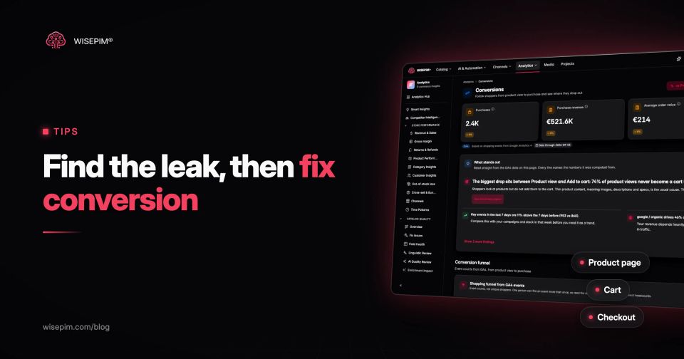
To increase your ecommerce conversion rate, find the step where shoppers drop out and remove the reason they leave there. For most stores that means four places: category pages where shoppers cannot narrow the list, product pages that leave questions unanswered, a cart that hides the real total, and a checkout with too many fields or too few ways to pay. Speed and trust run underneath all four.
Conversion rate is orders divided by sessions, times 100. Work out yours with the conversion rate calculator, then use the funnel to decide where to start instead of copying a list of tips. This guide goes through each page type with the fixes that research from Baymard Institute and Google supports, and a product page audit you can repeat on your own catalog. It does not promise a percentage: any uplift depends on where your store leaks today. Conversion rate is one factor in the revenue formula; for traffic, order value and repeat purchases, see our guide on how to increase ecommerce sales.
Find the leaking funnel step before you change anything
A store-wide conversion rate hides where the problem is. Break the funnel into steps and compare the drop between each. With the GA4 ecommerce events most platforms send by default, the steps are:
- `view_item_list`: a shopper sees a category, search or collection page.
- `view_item`: they open a product page.
- `add_to_cart`: they add a product.
- `begin_checkout`: they start checkout.
- `add_shipping_info` and `add_payment_info`: they get through the checkout steps.
- `purchase`: they pay.
Then segment before you conclude anything. Mobile and desktop usually convert very differently, so do new and returning visitors, and paid and organic traffic. A low rate from one ad campaign is a targeting problem, not a product page problem. Our ecommerce KPI guide has the formulas for add-to-cart rate, checkout completion and the other step metrics.
A few rules keep the analysis honest:
- Compare full weeks. Weekday and weekend traffic convert differently, so a Tuesday-to-Thursday comparison misleads.
- Look at products, not only pages. A category can convert well overall while ten of its products with missing images or prices drag it down.
- Check event counts against orders. If GA4 shows fewer purchases than your platform, fix tracking first, or every rate you calculate is wrong.
Category pages: help shoppers narrow the list
On a category page, the job is getting from 400 products to the three worth opening. When that fails, shoppers leave before they ever see a product page, and the product page fixes below never get a chance.
- Filters that match how people choose. Size, color, material, capacity, compatibility, price. Filters only work when the attribute is filled for every product: a "Material: merino" filter that covers 40% of your merino products hides the other 60%. Our article on product filter UX covers the interface side.
- Product cards with the deciding detail. Price, the main variant choice ("6 colors"), stock status and one key spec where it matters, such as capacity for a coffee maker or size range for shoes.
- Sorting that defaults to something useful. Best sellers or relevance, not newest or alphabetical.
- Search that finds what shoppers type. Many shoppers skip the category tree and search. A zero-result search is a lost order; our guide to ecommerce site search explains how product data decides what search can find.
Product pages: answer the questions that block add to cart
The product page is where the shopper decides, so unanswered questions cost the most here. Shoppers who leave here are usually missing one answer: will it fit, does it work with what I have, what exactly is in the box, when will it arrive, and can I send it back.
Research points at content first. Baymard Institute found that 56% of users explore the images first on a product page, and that 52% of sites did not add descriptive text or graphics to images of their top-selling products. Fix the page in this order:
- Images that answer questions. Several angles, a scale reference, the product in use, close-ups of material and connectors, and every color variant photographed. A shopper who cannot see the back of a backpack cannot judge its pockets.
- Specs where shoppers look. Dimensions, weight, material, capacity, compatibility and what is included, as a scannable list near the top, not buried in a tab or a paragraph.
- Sizing for anything worn. Baymard found that 83% of desktop and 87% of mobile apparel sites lack sufficient size information. A size chart per product type, with measurements and fit notes, reduces both hesitation and returns.
- Delivery and returns next to the button. Expected delivery date, shipping cost or free-shipping threshold and the return window, without opening another page.
- Clear price and stock state. Price per variant, unit price where relevant, and "in stock, ships today" or an honest back-in-stock date.
- Reviews and real answers. Reviews with photos, and answers to the questions customer service already gets by email.
These are product data problems before they are design problems. A template cannot show a size chart, a capacity or a compatibility list that is not in the product record.
Product page audit: a 12-cup drip coffee maker
Here is the kind of gap list a 20-minute audit produces on a typical product page, and the fix for each:
Product page audit: 12-cup drip coffee maker
| Two images, both front-on on white | Add the carafe, the filter basket, the control panel close up, and the machine on a counter next to a mug for scale. |
|---|---|
| Capacity says "12 cups" only | Add liters and the cup size the manufacturer counts with, because a "cup" is often far smaller than a mug. |
| Description is the supplier's marketing paragraph | Replace it with what the shopper needs: brew time, keep-warm duration, auto-off, dishwasher-safe parts, filter type (paper or permanent, size 4 or 1x4). |
| No dimensions | Add height, width and depth, so shoppers can check it fits under their cabinets. |
| Delivery and returns only in the footer | Show the delivery promise and return window under the price. |
| No reviews yet | Send a review request after delivery and add an answers section with the five questions customer service gets most. |
Repeat this on your top 20 products by traffic, then turn the most common gaps into rules for the whole catalog.
Product content changes can move conversion measurably. Snusk, a Swedish webshop, saw an 18% increase in product page to cart conversion after improving and translating its catalog with WISEPIM (read the case).
Cart page: shipping cost and the free-delivery threshold up front
The cart is where surprise costs appear, and surprise costs are the most cited reason for leaving. In Baymard's cart abandonment research, with the "just browsing" group excluded, 40% of US shoppers who abandoned during checkout named extra costs being too high (shipping, tax, fees), and 12% said they could not see or calculate the total order cost up front.
- Show shipping cost in the cart, or a delivery estimate based on country or postal code, not only at the last checkout step.
- Show the free-shipping threshold and the distance to it. "€8.40 to go for free delivery" is clearer than a banner on the homepage.
- Make the cart editable. Change quantity, variant or size without going back to the product page.
- Keep the cart. A cart that survives a closed tab or a switch from phone to laptop gives the shopper a reason to come back.
Checkout: fewer fields, a guest option and enough ways to pay
Checkout problems are the easiest to measure and among the easiest to fix. Baymard's numbers for US shoppers who abandoned during checkout: 18% left because the site wanted them to create an account, 17% because checkout was too long or complicated, 19% because they did not trust the site with card details, and 9% because there were not enough payment methods. Baymard estimates the average large ecommerce site could raise its conversion rate by 35.26% through better checkout design alone, which shows the size of the problem rather than a result you should expect.
Why US shoppers abandon checkout
| Category | Share of shoppers who abandoned |
|---|---|
| Extra costs too high | 40% |
| Did not trust the site with card details | 19% |
| Account required | 18% |
| Checkout too long or complicated | 17% |
| Website errors or crashes | 17% |
| Unsatisfactory return policy | 13% |
| Could not see the total cost up front | 12% |
| Not enough payment methods | 9% |
The average checkout had 11.3 form fields in Baymard's 2024 benchmark, while most sites need only 8. The fields to cut or hide first:
- One full-name field instead of separate first and last name.
- Address line 2, company name and a second phone number behind a link.
- Billing address hidden behind "same as shipping", checked by default.
- The coupon field collapsed behind a link, so shoppers without a code do not leave to search for one.
- Account creation moved to the confirmation page, after the order is placed, with guest checkout as the default path.
Then check payment: the methods your market expects (iDEAL in the Netherlands, Bancontact in Belgium, cards and wallets almost everywhere), express wallets for mobile and recognizable security cues on the payment step. We wrote more about how upstream data affects checkout, such as weights that drive shipping costs and stock that must be right when the order is placed.
Page speed and site errors: the losses you do not see in design reviews
Slow and broken pages lose orders without anyone noticing in a design review. In Baymard's survey, 17% of shoppers who abandoned checkout cited website errors or crashes. On speed, a study Google commissioned from 55 and Deloitte, Milliseconds Make Millions, found that a 0.1 second improvement in mobile site speed across four metrics went with an 8.4% higher conversion rate on retail sites. It covered 37 brand sites, and every page in the journey had to improve, so read it as evidence that speed matters, not as a forecast for your store.
For most stores, the largest speed problem is product images: 4 MB supplier photos scaled down in the browser. Resize them to the largest size the theme displays, convert them to WebP and compress them, in bulk, before they reach the storefront.
Trust signals shoppers check before they pay
Shoppers buying from a store for the first time look for proof that it is real and that they can get their money back. Baymard lists an unsatisfactory return policy as the reason for 13% of checkout abandonments. Make these easy to find from every product page and the checkout:
- A return policy in plain language, with the return window and who pays return shipping.
- Contact details with a real address and a response time you keep.
- Reviews from a recognized review platform, including the critical ones.
- Recognizable payment logos and delivery partners.
- Product information that is consistent across the page, the cart and the order email. Conflicting sizes or specs between those places are a trust problem, not only a data problem.
Running conversion tests you can trust
Not every change needs an A/B test, and many stores do not have the traffic to run one properly. Fixing a missing size chart or a broken mobile button is just a fix. Test when you change something where the outcome is unclear, such as layout, pricing display or the order of checkout steps.
- Decide the metric and the stop rule before you start, for example add-to-cart rate on product pages, run for at least two full weeks.
- Change one thing per test, or you will not know what caused the result.
- Watch a guardrail metric. A change that raises conversion and also raises returns, for example by overselling a product, did not help.
- Without enough traffic for a test, compare before and after over matching periods and note seasonality, campaigns and stock changes.
Conversion fixes scheduled over 30 days for a small store
A 30-day conversion plan for a small store
- 1
Days 1 to 3
Verify tracking
Check that GA4 purchase events match platform orders, then build the funnel by device.
- 2
Days 4 to 7
Pick the leaking step
Pick the step with the biggest drop and list the top 20 products or pages by traffic in that step.
- 3
Days 8 to 14
Audit 20 product pages
Audit those 20 product pages with the coffee maker audit above and fix images, specs, sizing, and delivery and returns info.
- 4
Days 15 to 18
Fix the cart
Add shipping cost and the free-shipping threshold to the cart.
- 5
Days 19 to 24
Shorten checkout
Cut checkout fields, make guest checkout the default and check payment methods per market.
- 6
Days 25 to 30
Speed up and compare
Compress product images, test the full purchase on a phone and compare the funnel with the first week.
Finding product pages that get views but few add-to-carts
Most of the product page fixes in this guide come down to fields: images per variant, filled attributes for filters, specs, dimensions, sizing and short descriptions that answer real questions. WISEPIM finds the products missing those fields with Quality Guard and quality scores, fills descriptions and attributes with AI enrichment for you to review, and resizes and converts images in bulk. Its analytics combine Google Analytics 4 data with catalog quality, so you can see which products get views but few add-to-carts. More on conversion optimization with WISEPIM.